
Designing an ML experiment and AI dashboard
I helped devise Expedia’s first content-personalization experiment using contextual bandits. Then I created a dashboard to make sense of the results.
Background
Data and AI was a nascent program within Expedia’s Emerging Business organization. It’s objective was to optimize user experiences by leveraging machine learning. I was hired to lead content design for the team.
My first project was an ambiguous experiment to pilot contextual, multi-armed bandits (MAB) for content personalization. We hypothesized that personalized content would be more successful than the current, one-size-fits-all model.
Challenge
Aside from MAB, there were few project requirements and little information provided:
- The project brief didn’t include data, research, or direction on how content should be personalized
- The design tasks were to pick a content element on an insurance touchpoint and create “many variants”
- The goal was simply “make a big impact,” as my product partner believed that leadership buy-in hinged on the success of this test

Strategy
1. Ground content in user needs
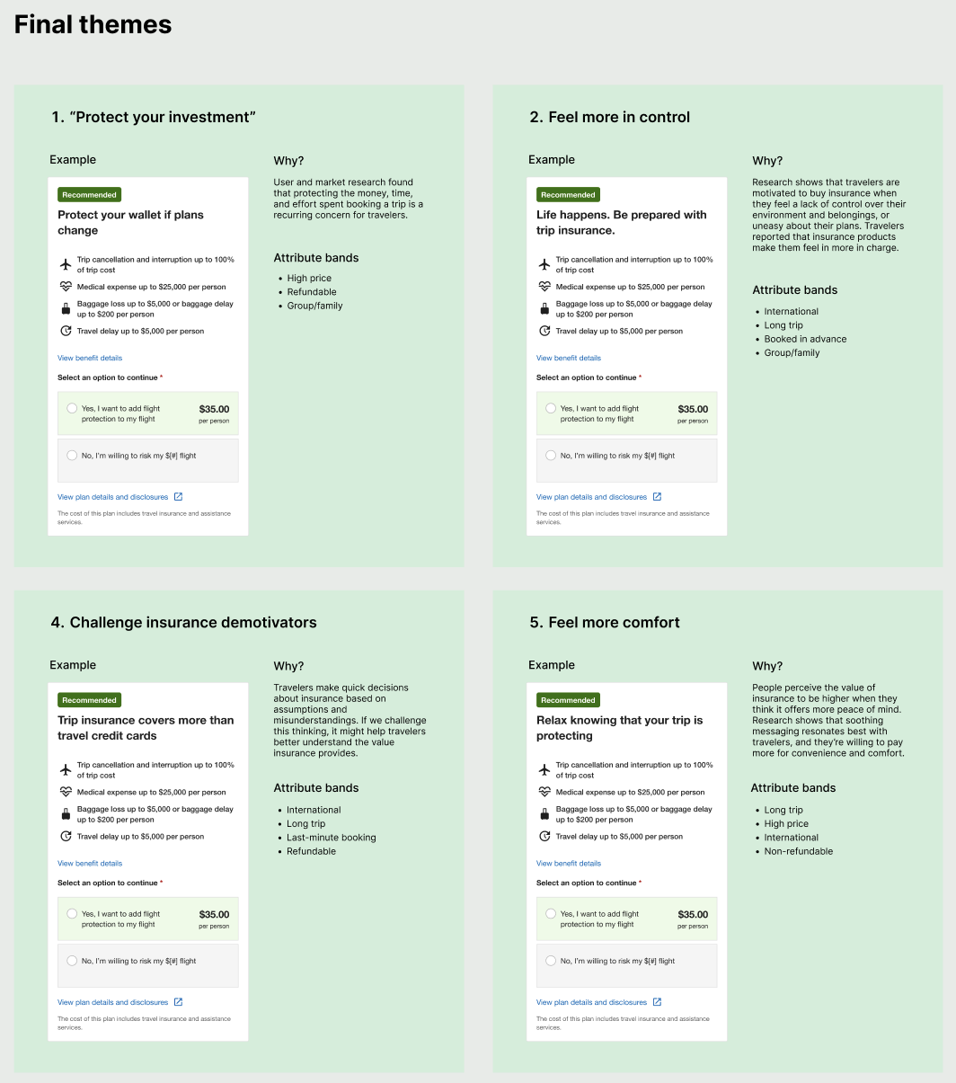
I believed that variants were more likely to succeed if they addressed users’ concerns and motivations. I quickly reviewed UXR studies on insurance, then created content themes based on the insights.
2. Choose impactful elements
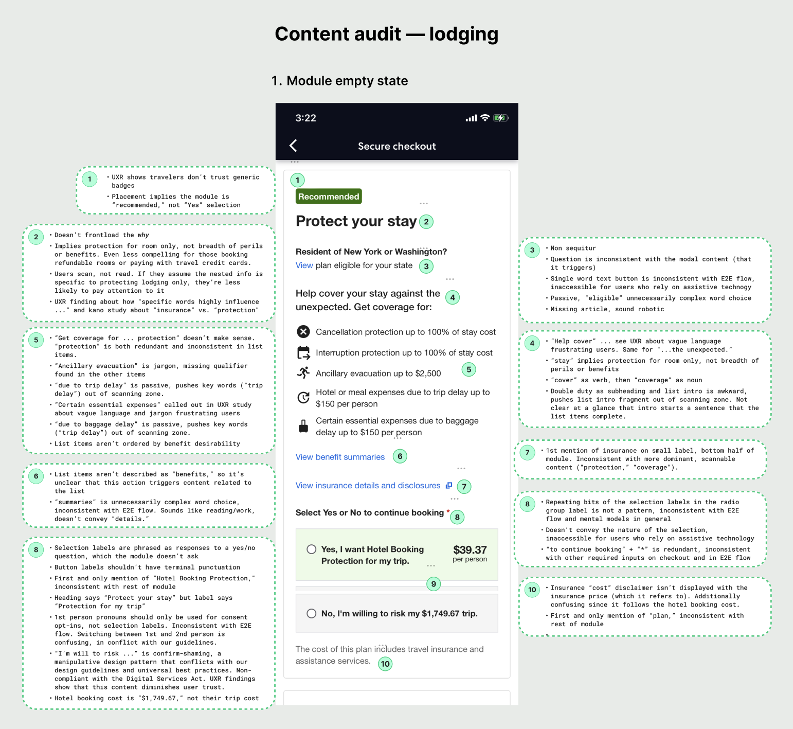
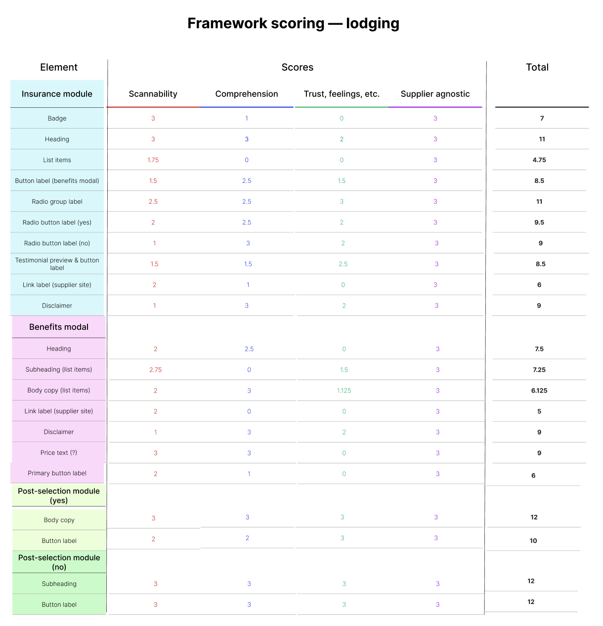
I audited insurance touchpoints for usability issues, looked at the interaction data, and used that info as the basis for a scoring framework. Then I scored and ranked the content elements according to their potential for impact.
3. Establish guardrails
To anticipate our content needs, I reviewed the possible attributes and contexts with ML scientists. I drew up content guardrails to ensure the variants squared with our insurance partner guidelines, content style guide, and UXR insights.
4. Build coalition
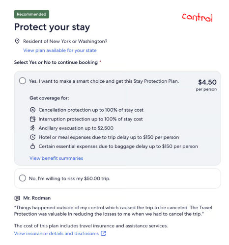
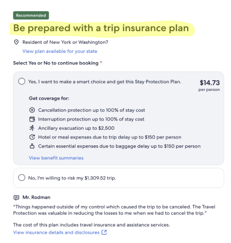
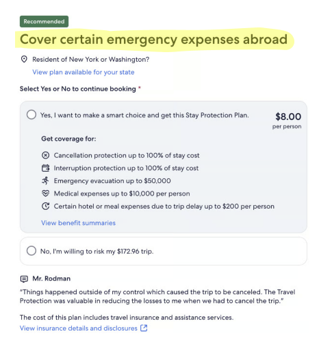
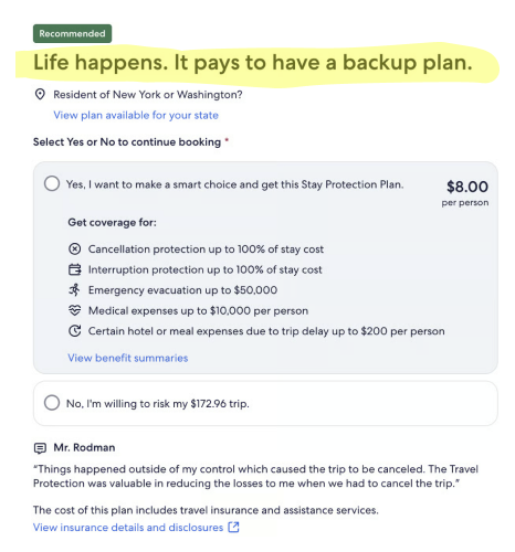
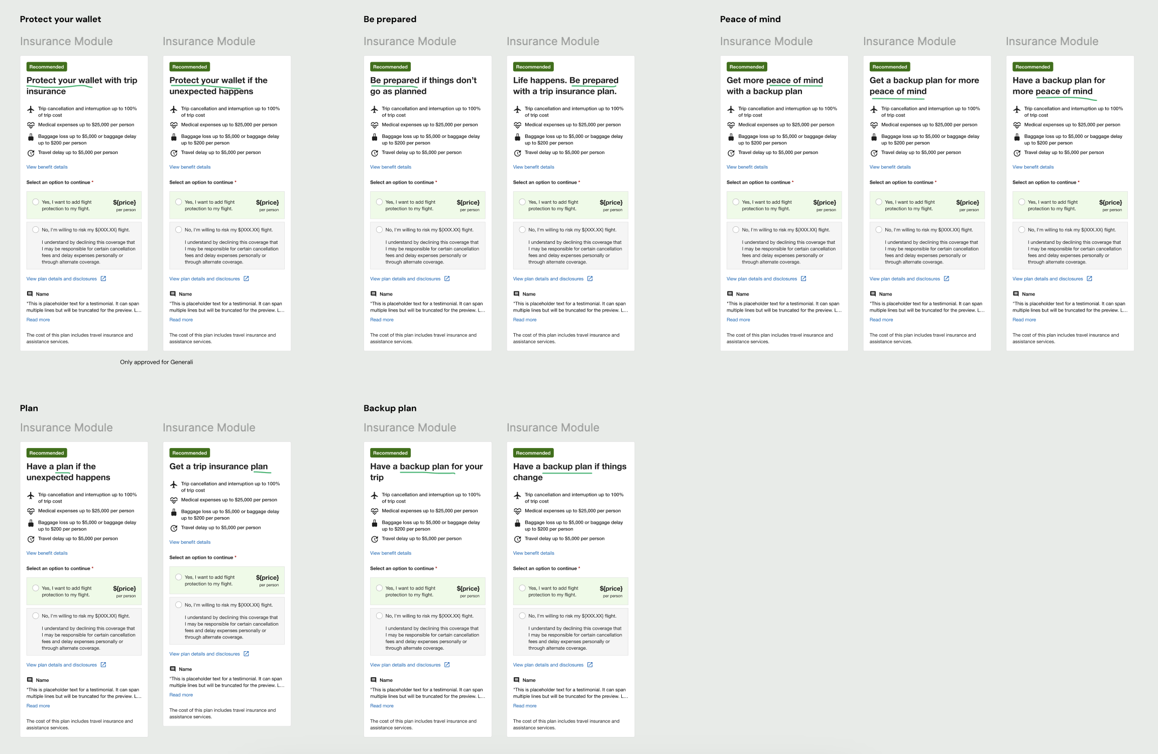
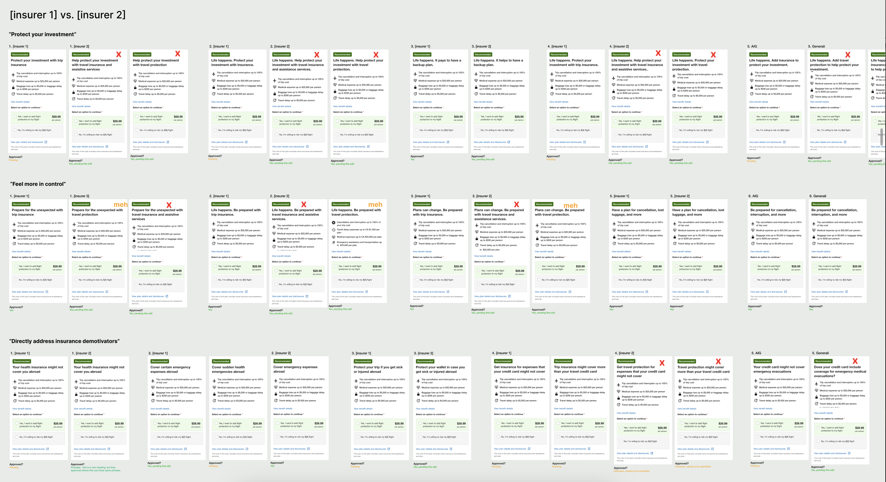
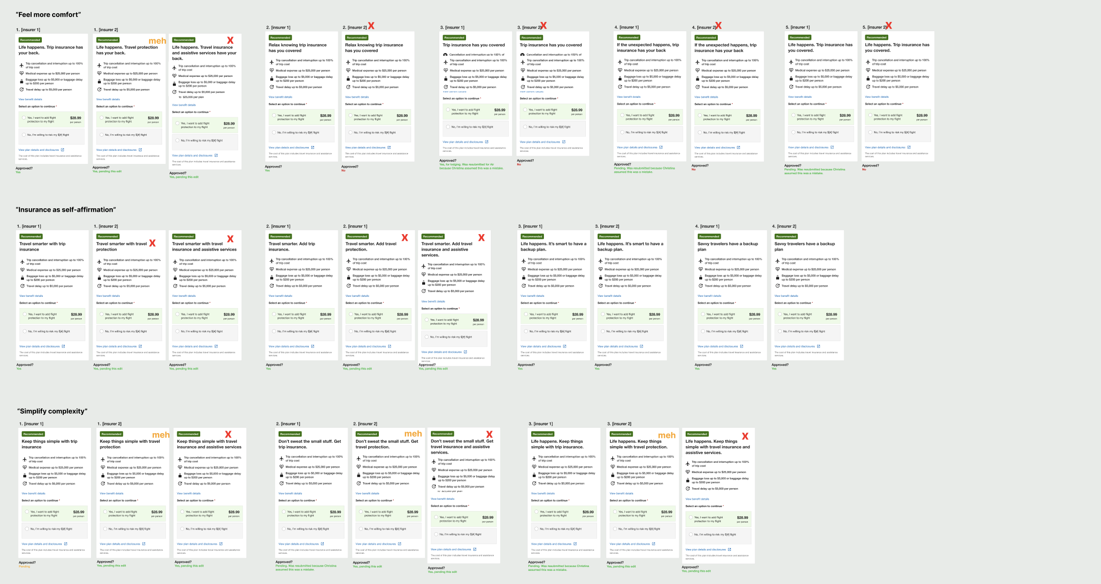
As they developed, I shared the content themes, element rankings, and attribute suggestions with stakeholders for feedback and alignment. We concluded that our inaugural test would focus on the module heading for lodging insurance.
Ideation
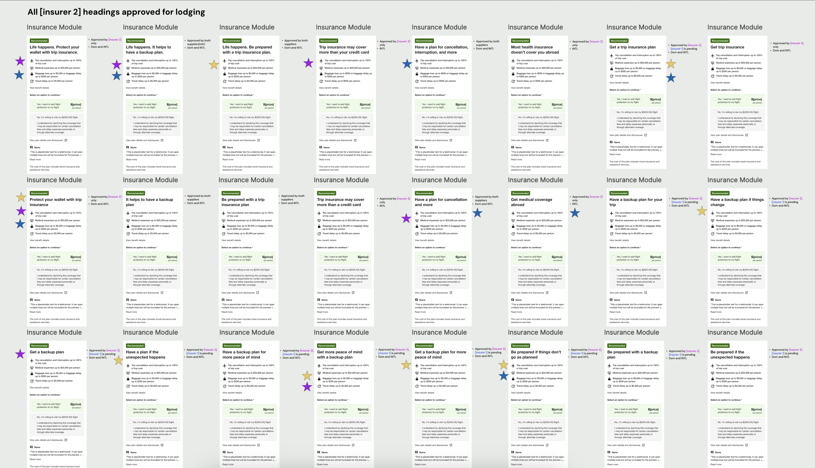
I observed how people on traveler forums talked to each other about insurance, and took inspiration from the language they used. Across the six content themes, I drafted heading variants that targeted our test attributes and the different requirements from insurance partners. After multiple reviews with insurers and stakeholders, we finalized the test variants for each partner.
Delivery
The test needed to run for at least eight weeks, but we quickly observed some patterns. The most successful variants belonged to the “feel more in control” theme and included key words such as ‘prepare’ and ‘plan.’ But as a whole, the variants weren’t performing as well as we hoped.
When a checkout page release put the experiment on hold, I used the time to iterate on the variants based on our learnings. After getting partner approval for the content changes, we restarted the test with the updated variants.

+$1M
Estimated uplift in annualized insurance GP
+2%
Estimated uplift in booking conversion
Impact
The high-level result of our first MAB test revealed that the variant headings outperformed the control overall. This validated our hypothesis about personalized content and demonstrated the “big impact” that contextual bandits could have on business outcomes. We automatically scaled the winning variants across their respective contexts.
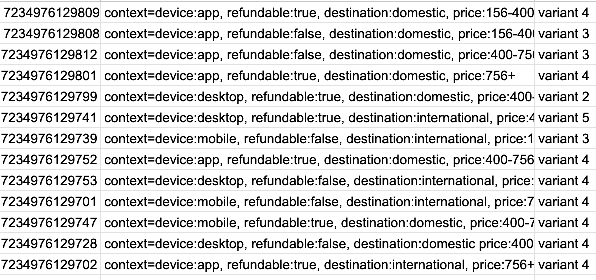
There was just one hitch — we couldn’t access the content data.
Next steps
We needed the content data to learn how each heading performed and if there were any actionable insights. But after tweaking the test setup, my data partner could only retrieve a spreadsheet with the experiment arm information. It was barely understandable, let alone actionable.
So I experimented with AI tools to make the content data clear and useful.
Coda
I fed the arm data into Expedia’s AI playground, trained a Claude model to recognize the contexts, then had it analyze the heading performance. This is how I learned that the variant headings beat out the control in every context but one.
To better visualize the data, I vibecoded an interactive dashboard with Figma Make.
I broke down the heading performance by attribute, band, and context. Then I added tabs for insights, recommendations, and test images .
The dashboard helped my stakeholders and I quickly understand how themes and variants performed within the experiment, giving us direction for future tests. At the request of an actuary partner, I turned the dashboard into a template for future experiment results.
Please note: The dashboard is meant to be a bit irreverent. My team had an inside joke about “pie,” plus there’s a Janet Jackson GIF.

© 2026 April De Costa | Content designer and strategist